Showing posts with label Infographic. Show all posts

02 August 2020

Systematics ~ Sociome, Diseasome, Interactome

Tim Clancy spots this complex systems hierarchy infographic from Handbook of Systems and Complexity in Health, 2013...
"A great example of systems thinking. The Manifest (top), Latent (middle), and Deep Latent (bottom) levels of hierarchy in a complex system.  In truth there are many levels of hierarchy in any system -- and what gets modeled or represented is a design choice based on problem definition and boundary selection."

13 March 2020

Covid-19 Trendscape ~ Comparative Exponentials

Andreas Burkert has been updating Covid-19 exponential trendscape plots.  This one's most recent as of Friday 13th posting, but see his FB page for the latest...

11 February 2020

Humanity’s Sweet Spot ~ Sustainable + Social

MIT colleague Anna Waldman-Brown spotlit this provocative infographic in one of her "Academic frustrations of the day", a plot of...
"...the extent to which a country is meeting its people’s essential needs while at the same time ensuring that its use of Earth’s resources remains within its share of the planet’s biophysical boundaries."
This is on Kate Raworth's page and is named (terribly) "doughnut economics". But I like the graphic... The quadrants represent alternative thematas to "developed" vs "developing" and stand for:
A. Countries that are barely crossing any planetary boundaries, but are falling very far short on meeting people’s needs
B. Many middle-income, ‘emerging’ economies are both falling short on social needs while already crossing biophysical boundaries.
C. Today’s high-income countries cannot be called developed, given that their resource consumption is greatly overshooting Earth’s boundaries and, in the process, undermining prospects for all other countries.
D. No country is yet in sweet-spot cluster D (for Doughnut!) – so how many years until some are there, and which will make it there first?

28 December 2019

21 December 2019

Mapping Corruption ~ Transparency to Opacity

Visual Capitalist's Chart of the Week maps Transparency International 2018 data about corruption perceptions worldwide...

31 August 2019

Remittance Flows ~ FT Infographic on Pathways

The FT writes about Remittances: the hidden engine of globalisation...
"The number of people in the world who live outside the country of their birth has risen from 153m in 1990 to 270m last year according to the World Bank, swelling global remittance payments from a trickle to a flood. As migration has increased, these financial snail-trails have become one of the defining trends of the past quarter-century of globalisation -- the private, informal, personal face of global capital flows. For many developing economies, it is a lifeline. [...] Some governments have sought to channel remittances into development efforts; Indonesia is the latest country to consider a “diaspora bond” in a bid to tap the savings of its wealthier overseas residents."

24 August 2019

GB, UK Explained ~ CGP Grey's Crown Venn...

CGPGrey explains The Difference between the United Kingdom, Great Britain and England...
And yes, I did post this same thing six years ago. I both forgot and still think this kind of Venn viewing is incredibly useful!-)

21 July 2019

Creative Class Growth ~ Mapping Rise of Rest...

Richard Florida writes in CityLab that Maps Reveal Where the Creative Class Is Growing in the US...
"A growing chorus of economists and urbanists suggest that we may be seeing the “rise of the rest,” a result of both increasingly unaffordable housing in established hubs and the improvement of the economies in less-established hubs. [...] The map shows the percentage growth in the creative class from 2005 to 2017. A number of Rustbelt and Sunbelt metros which have previously lagged now show robust growth. Salt Lake City posted the fastest growth, with Pittsburgh and Cincinnati next in line. Las Vegas, which had the smallest creative class share of large metros in 2005, also saw significant growth. Of leading creative class metros, only Seattle and Baltimore registered comparable gains. [...] The even better news is that the creative class -- which often garners the highest paying jobs -- appears to be growing as a percentage of total workforce employment across the board."

06 July 2019

Connected World ~ International Collaborations

Nature shares Connected World infographic spotlighting patterns of international collaborations from 1 February 2018 to 30 January 2019 as captured by the Nature Index...

27 May 2019

Personal Electric Mobility ~ Market Size & Share

Very interesting to see adoption of personal electric vehicles in Europe and Asia. Curious how much of the advantages are State subsidy and tax relief? Norway, for example, offers substantial tax benefits, the right to drive in carpool lanes solo, and free charging, which kind of distorts market action. Also, China has endless ways of State subsidies for both personal and mass transit electrification. Which all may make environmental sense. In any case, here's share and size info from Statista...

31 March 2019

EARTH ~ All of Humanity on One Chart...

Visual Capitalist helps us visualize where people live? Roughly 1/5 in each of Eurasian-Americas, Africa, Rest-of-Asia, Tjina, and Hindia.  Or on EARTH for short... https://www.visualcapitalist.com/worlds-7-5-billion-people-chart

25 January 2019

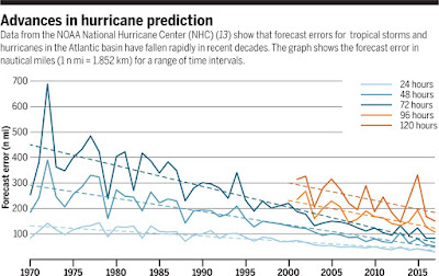
Hurricane Prediction ~ Forecast Quality Progress

Richard B. Alley, Kerry A. Emanuel, Fuqing Zhang write in Science about Advances in weather prediction...
"In recent decades, advances in forecasting have been rapid, arising from improved observations and models, and better integration of these through data assimilation and related techniques. Investment in weather forecasting pays large dividends, ranging from 3 to 10 times the costs.  [But] the developing world is especially vulnerable to weather disasters yet is underserved by forecasting."
http://science.sciencemag.org/content/363/6425/342?fbclid=IwAR1H8uKcUtkZpnxS3Wghw5sAjI2ftM4dkstvd8Xg5lmRfHkhJSj5i-i8xkY

08 January 2019

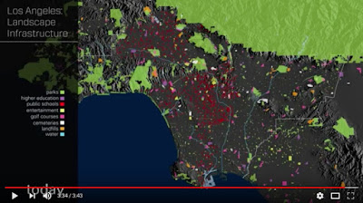
LA Timelapse Map ~ Infra, Nets, Pop, Econ, etc!

The Getty Research Institute shares timelapse maps of Los Angeles Instrastructure, Networks, Settlements, Population, Economy, and Conflicts! https://www.youtube.com/watch?v=jmvwp5UpB1U