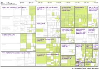
"Who used the new stats from the Bureau of Labor Statistics to create it. Things really get interesting, though, when you start looking at the data not just nationally, but by state."

Exponential Innovations Everywhere
* * *
Joost Bonsen's Opinions on How Money, Ideas, and Talent can
Enable Health, Wealth, and Happyness for Each plus Achieve Liberty, Prosperity, and Vitality for All and Ultimately Help Us Spread Beyond Our Cradle Planet Earth
"Who used the new stats from the Bureau of Labor Statistics to create it. Things really get interesting, though, when you start looking at the data not just nationally, but by state."


No comments:
Post a Comment